The first developer preview of the upcoming Android P is already out a few days ago.This is the first look at the visual refresh that the tech-giant Google was rumored to be working on from a few months ago. This complete visual preview of the upcoming Android P is an extremely early build of the software, so it is expected that more changes are on their way and some of what is mention here might look different in the next preview. Analysing this early skeleton developer version makes it clear that Google is taking things in a rounder and a more colorful direction.
The next developer preview of Android P is expected to be scheduled in the month of May and that will be our very next opportunity to find out what are the additional changes to Android as it appears on Google’s Pixel devices and other products. Let us have a glimpse of what’s new in the latest initial release:
THE CLOCK MOVES TO THE LEFT FOR NOTCH-FRIENDLY NOTIFICATIONS
The clock has been moved from the extreme right to the extreme left on the upcoming Android’P top status bar. The new OS is optimized for the notches- a new trend in the smartphones which might cut into the visible display area, so it starts piling up the notification right next to the time widget.A total of four different app icons will appear at a single time and after that, the Android P displays a simple dot to let the users know that there are more notifications waiting for them which can be seen once the user slides down the notification tray.
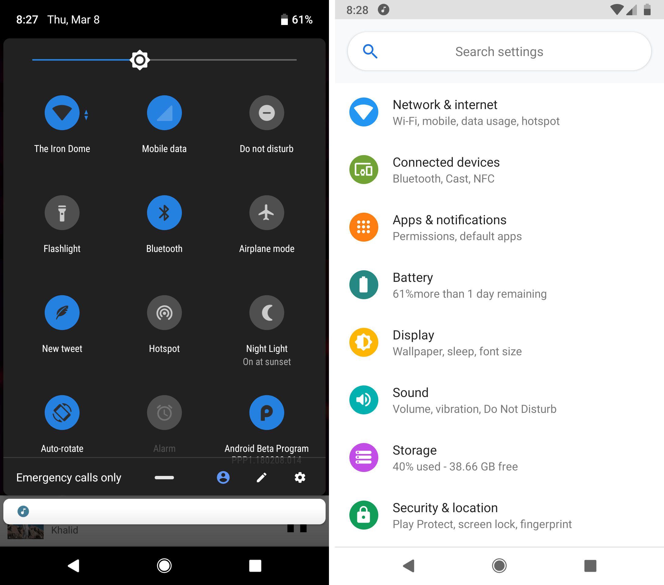
A MORE COLORFUL SETTINGS MENU
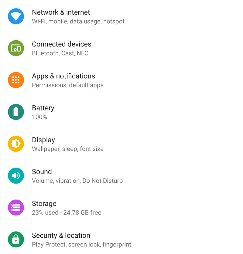
The tech-giant Google, over the years, seems to be obsessed with consistently color changing and working on the Settings screen with its every major Android update rolled out in the market. The new update highlights the fact that this year the company has made its mind of making things a bit more colorful than ever with new icons to the right of the sections like Network, Display, Battery, etc. The original layout in this version is barely changed yet but the grayscale icons which featured in Oreo are gone and replaced by colorful circles- more of the Samsung UI appearance.
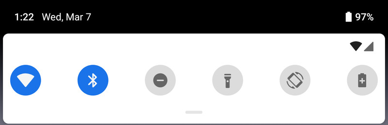
A MORE STRAIGHTFORWARD QUICK SETTINGS PULLDOWN
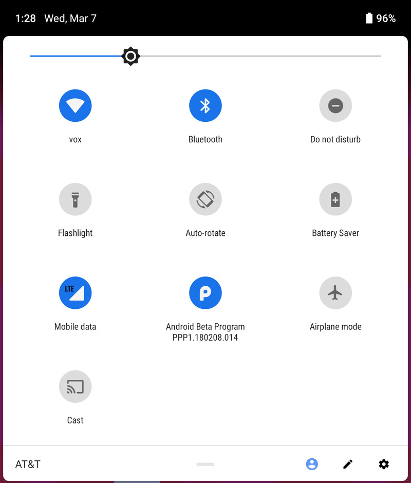
This is one of those segment where the company has ensured opting for changes in the previous versions. Similarly, Google has made changes in this version too. The changes include: corners have been rounded off, and the settings icon for the connectivity options like Wi-Fi, Bluetooth, etc. are now put inside the circles which take on a colorful accent mode when enabled by the user or go gray when it is switched off. The horizontal bar is also put nearly beneath the icons. When expanded fully, the new Quick Settings pulldown/menu looks somewhat like this:
THE DOCK LOOKS LIKE A DOCK AGAIN
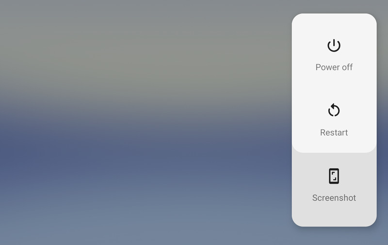
The native Power Off/Restart pop-up on the new Pixel phone comes with an extra added feature under those two options: Screenshot. So, if the normal button combo options or the selection is not working in given ideal options then all you have to do is to hold down the power button, tap the screenshot button and guess what: it will capture everything present on the screen.
THE VOLUME SLIDER SHRINKS AND MOVES TO THE RIGHT SIDE
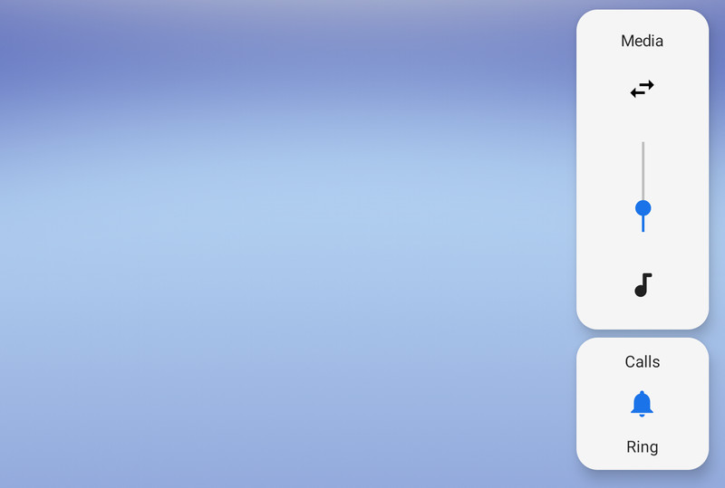
As witnessed in Android Oreo, the company has relocated the power options and now in the same manner the company is doing similar with the software volume slider. This will be a bit tedious for the software engineers as they might need to do a little more extra work to make things more straightforward in this context. The early preview version makes it a bit confusing for me about the meanings of the arrows icon present, whether they are for Tapping the Calls or Ring button switches between ring, vibrate, and silent ringer.
THE PIXEL’S PRODUCT SANS FONT IS SHOWING UP IN MORE PLACES
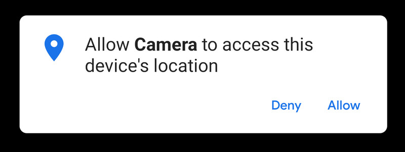
We don’t have any idea whether the complete move for the use of Pixel’s Product Sant Font is intentional or simply the result of being a very early build version of the Android P, but the font used by the Google for its pixel’s smartphone branding is visible in more places throughout the system, such as “Allow” and “Deny” here. It’s officially called Product Sans.
That’s all from the story! You’ve to wait for few months to find the complete story. For more updates stay connected and keep reading.