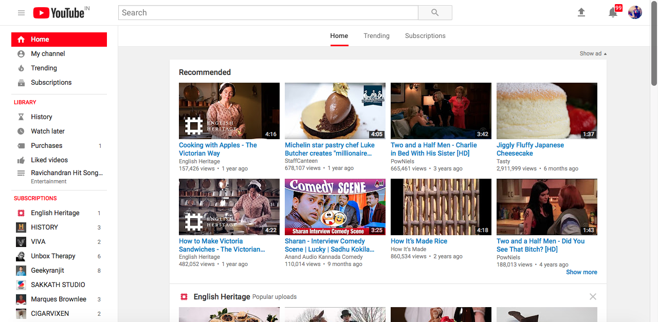
After 12 years, YouTube finally has a shiny newer logo. Along with the new logo, there are few more prominent changes across the platform.
The Play logo of the youtube is now separated from the word tube and placed at the beginning. Now the YouTube across the mobile version, Android app, iOS app and the desktop version are presented in the Google’s own material design in the plain white accent.
The new UI looks like a well-thought step from the Google across the right direction. Here is the official statement from the Chief Officer YouTube Neal Mohal.
“The updated Logo combines a cleaned up version of the YouTube wordmark and icon, creating a more flexible design that works better across a variety of devices, even on the tiniest screens. Why’s it more flexible? When room is limited (say on a smartphone) you can use the brightened up icon as an abbreviated logo, which will be seen more easily and read more clearly,”
Youtube mobile app is bound to receive additional features as the part of the on going processor. What do you think about the newly designed YouTube logo and the user interface, let us know in the comments below.